
Central Park Dashboard Redesign
Simplifying the Ticketing Experience to Drive Platform Adoption
My Role: UX/UI Designer | Company: Park Place Technologies | Year: 2024-Present

Project Impact
The dashboard redesign is launching to beta with expected outcomes of:
Increased user efficiency through faster access to ticket updates
Higher platform engagement and user exploration beyond ticketing
Foundation for future service-first expansion as Central Park evolves beyond ticketing management system
My Design Contribution
Redesigned the dashboard to restructure metrics and layout to surface information users actually need while removing clutter
Created user-centric V1. Designed experience optimized for current ticketing workflows while and bring in awareness of asset management capabilities in Central Park
Explored future-state possibilities. Designed speculative dashboards showing how the platform could scale as it becomes service-first
Improved sidebar navigation. Simplified the navigation structure to reduce visual noise and focus attention on primary tasks
Bridged design and development. Documented all design decisions with detailed specifications and collaborated with the product owner on implementation
The Problem
The original Central Park dashboard had multiple usability issues that created friction for users trying to access and manage tickets:
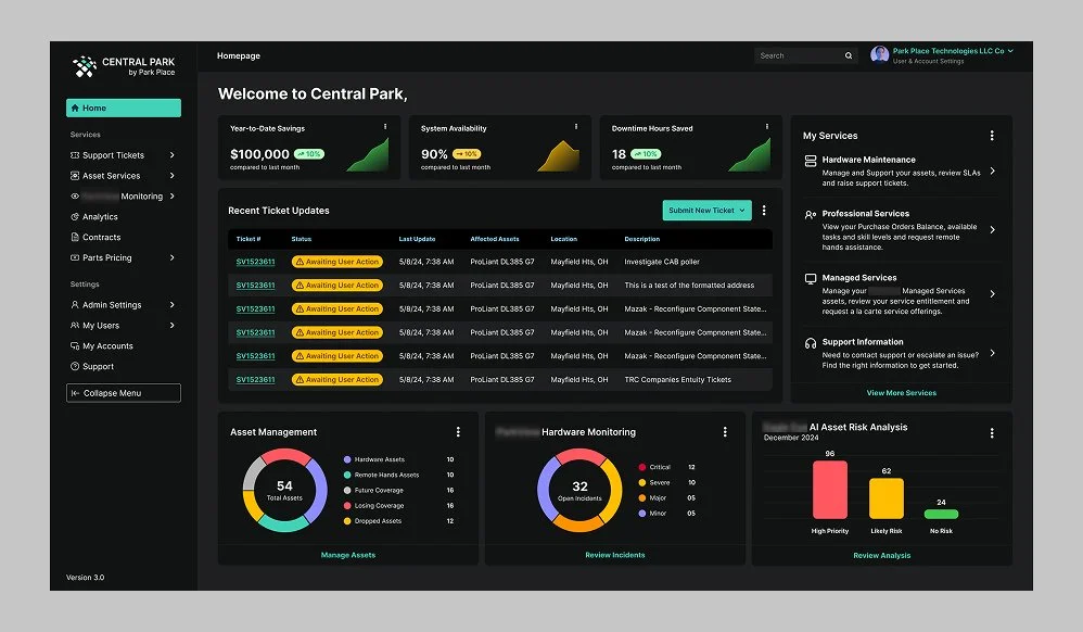
1: Dashboard metrics weren't useful. The dashboard displayed metrics that meant little to most users, especially smaller clients with low ticket volumes.
2: The ticket table on the top right wasn't styled like a functional table and only showed relevant information like ticket status, omitting critical information users needed.
3: Navigation and layout created confusion. The sidebar was wide and colorful with redundant labels like "Ticket Hub" and "Asset Hub," consuming valuable screen space. Secondary pages appeared as an accordion-style menu within the sidebar, adding to the confusion.
4: A large, interactive escalation map occupied significant real estate but had a clunky interaction model and confusing regional labels. Too complex for a contact directory.
5: Ad on the bottom right took up valuable screen space, low click rate signifying users do not find this useful and also can feel intrusive for the experience.
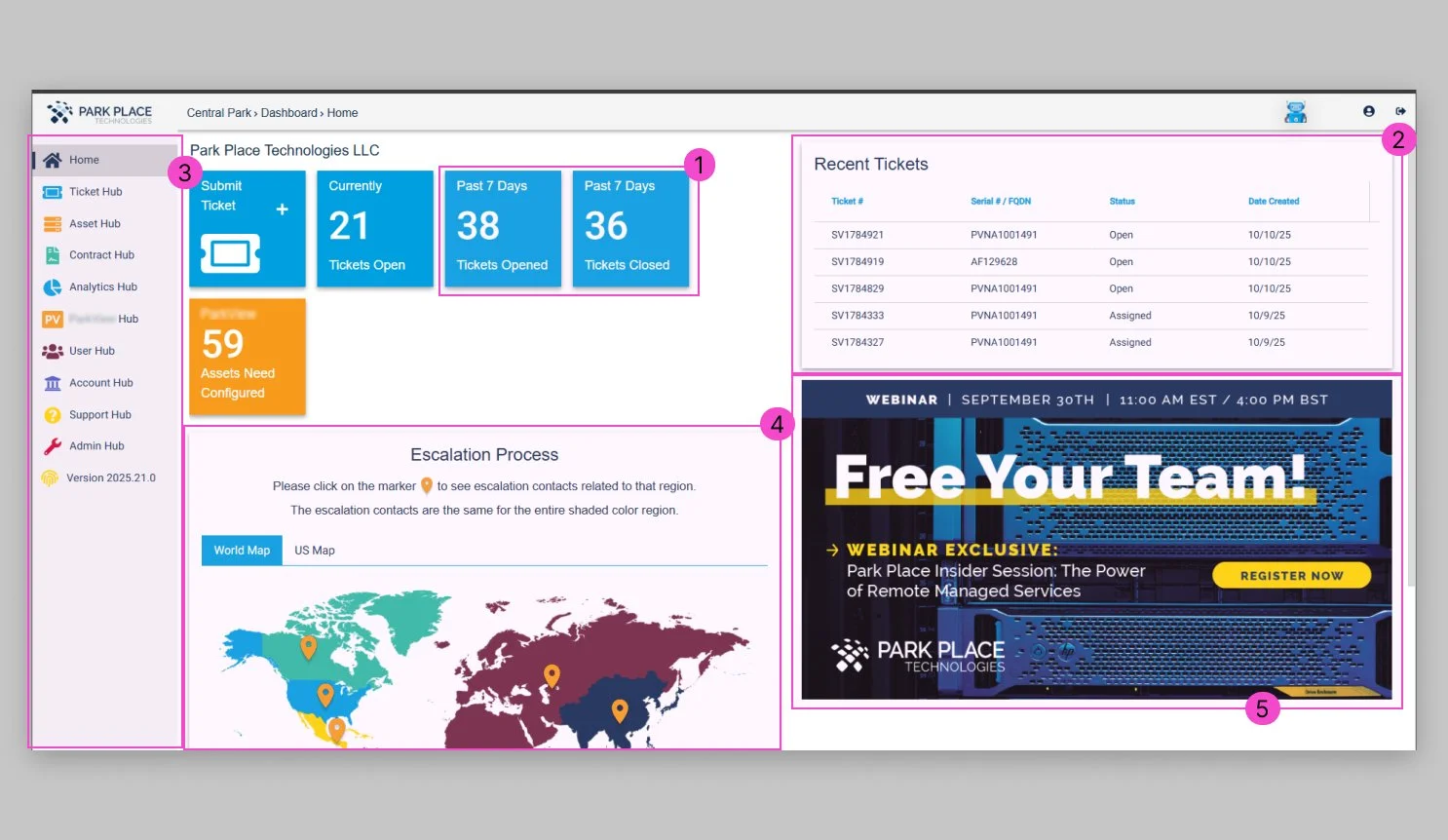
Users: IT administrators and support team members responsible for managing hardware and infrastructure support requests.
The challenge: Simplify the interface to reduce cognitive load, surface ticket information users actually need, clarify navigation, and highlight strategically useful data that aligns with both current user needs (ticketing efficiency) and future business goals (service expansion).
Research & Discovery
Heuristic Analysis: I evaluated the existing dashboard and sidebar using established UX principles and identified critical issues:
Metrics displayed didn't align with user priorities or business goals
Ticket section was under-emphasized despite being the primary reason users visit
Sidebar consumed screen real estate without providing clear value
Ad in dashboard felt intrusive and pushy for users who are going in to solve problems that impact their business
Stakeholder Interviews: I spoke with support staff and product managers to understand how customers were using Central Park and what frustrated them.
Key Insights:
Users needed faster, clearer access to their open tickets
"Hub" terminology didn't make sense to users
Support team kept receiving tickets about platform navigation confusion
Smaller clients found metrics like "past 7 days" irrelevant
There was interest in seeing services and contract renewals, but only after getting quick ticket visibility
Design Process
The goal was to create a dashboard that prioritized the ticketing workflow while leaving room to surface additional services as the platform evolved.
Early wireframe iterations focused on restructuring the dashboard metrics, improving the ticket table and narrowing down the data within it to the most important columns to create an overview of where the ticket was at. The goal was for the user to know where the ticket is at and what ticket it is without having to navigate to the detail page.
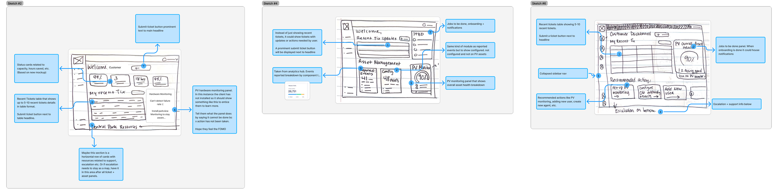
Initial brainstorming sketches with new feature annotations
Early wireframes exploring features proposed in early sketching
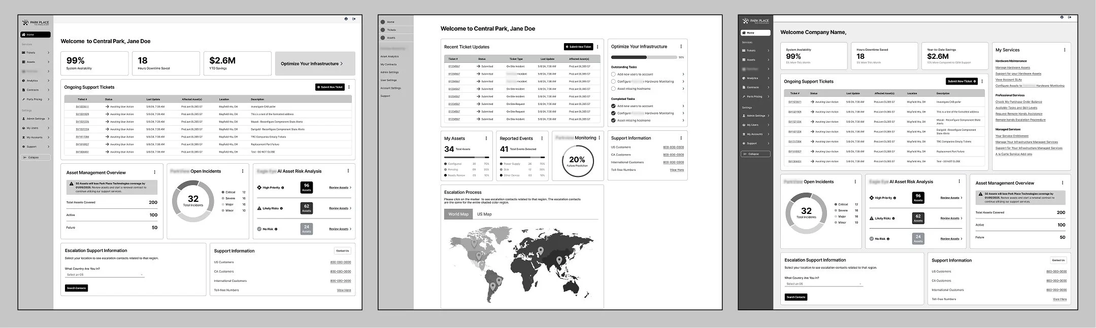
Mid-fidelity prototypes were reviewed with the product and engineering teams. Feedback helped refine which metrics to highlight, the structure of the ticket table, and what existing services we can integrate into the homepage using graphs to visualize data.
Strategic Consideration: I designed future-state dashboards showing how the interface could evolve as Park Place transitions to a service-first model, including visualizations of services, behind-the-scenes work, and event notifications. However, stakeholders decided to launch V1 focused on ticketing efficiency first. The development team was migrating to React and needed to stabilize the framework before adding complexity.
Redesigned homepage with strategic metrics and simplified navigation.
Testing out dark mode
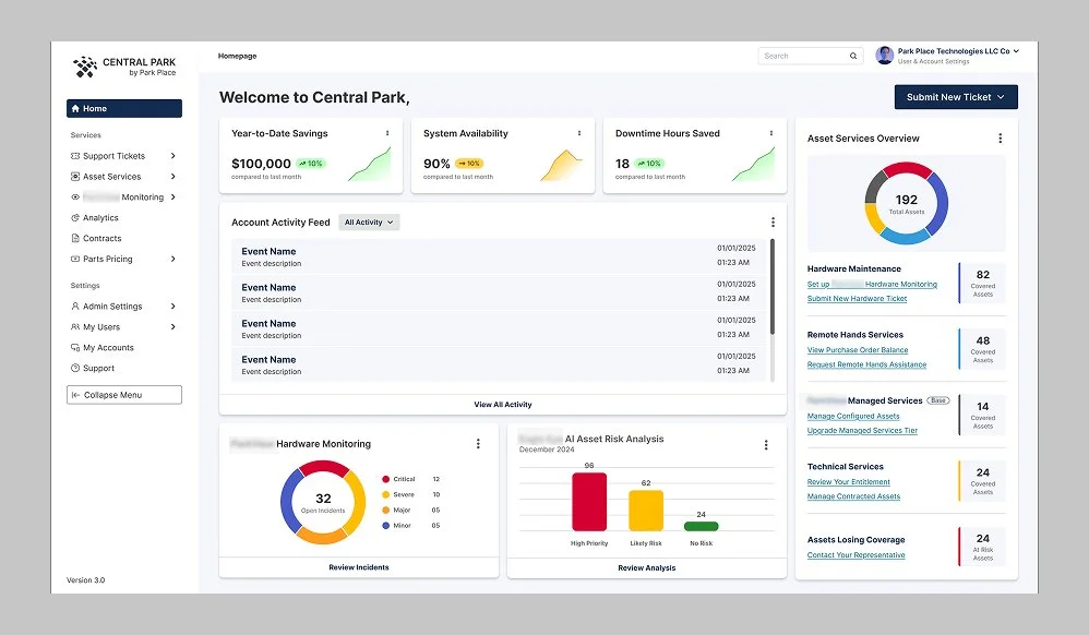
Version exploring notification feed, asset breakdown by service and CTAs, asset monitoring and AI risk analysis panels
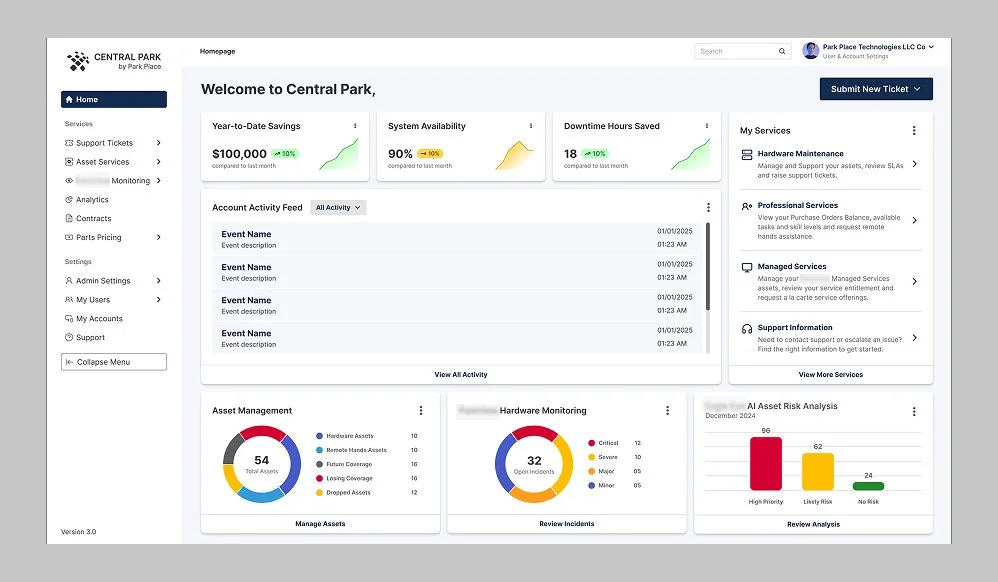
The Solution
I redesigned the dashboard with a focus on clarity, efficiency, and scalability. The new interface prioritizes the core user task (accessing and managing tickets) while creating space for future feature expansion.
Redesigned dashboard layout: Replaced generic metrics with strategically relevant information: resolved tickets (showing Park Place's work), awaiting customer action (highlighting user responsibility), active contracts, and pending renewals (introducing the service-expansion perspective).
Improved ticket section: Made the ticket table the focal point with a clean, scannable design that displays essential information (ticket status, asset details, and last update) allowing users to quickly assess open issues.
Simplified sidebar: Reduced sidebar width by stacking labels under icons for primary navigation. Secondary page links now appear in flyout menus on hover, eliminating clutter while keeping functionality accessible. Removed outdated items like "Parts Pricing Hub."
Room to grow: The design establishes a visual language and information architecture that can accommodate future service-first features without requiring a complete overhaul.
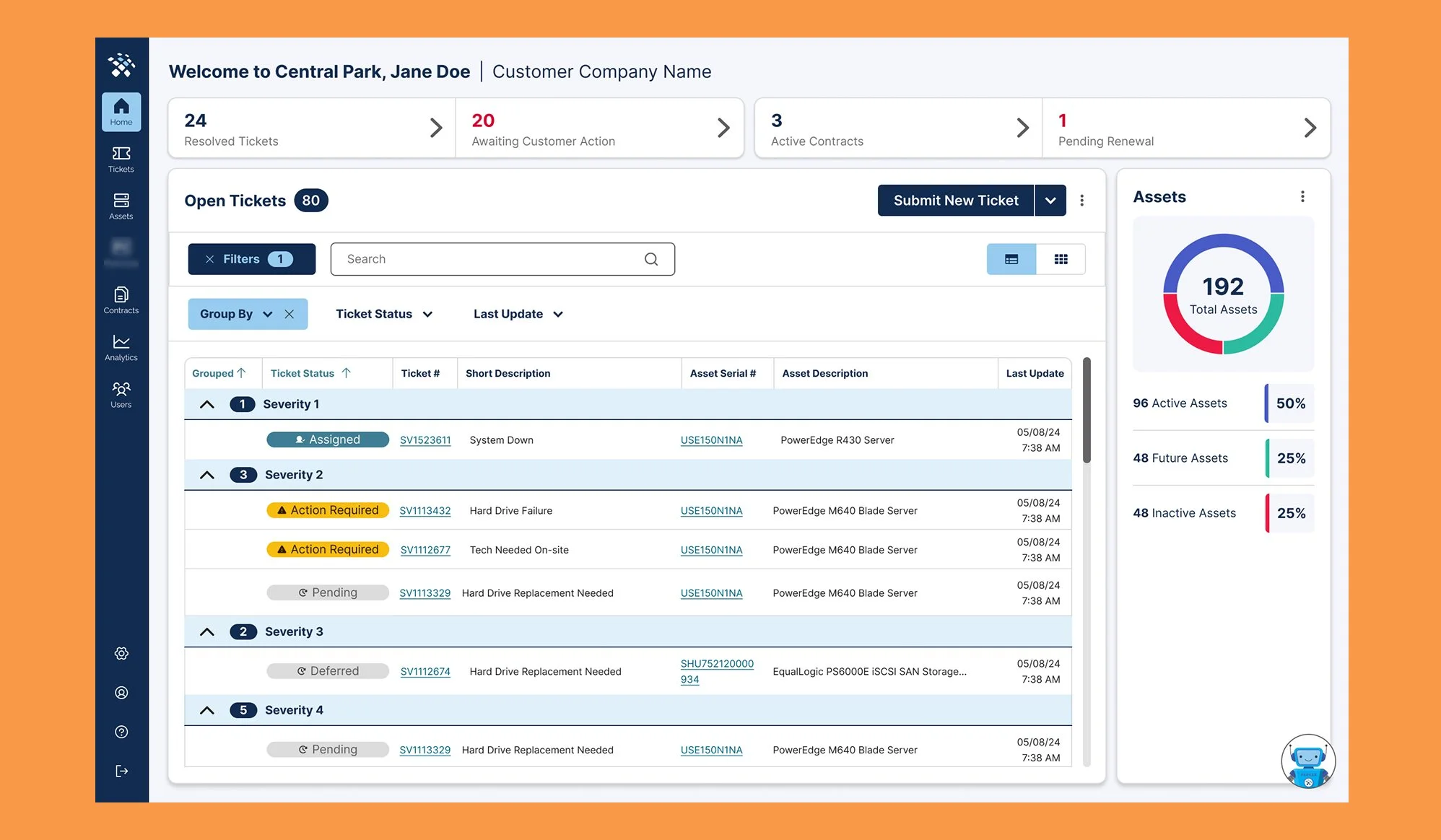
Final dashboard design showcasing new table grouping feature

Modernized sidebar with fly out menu on hover
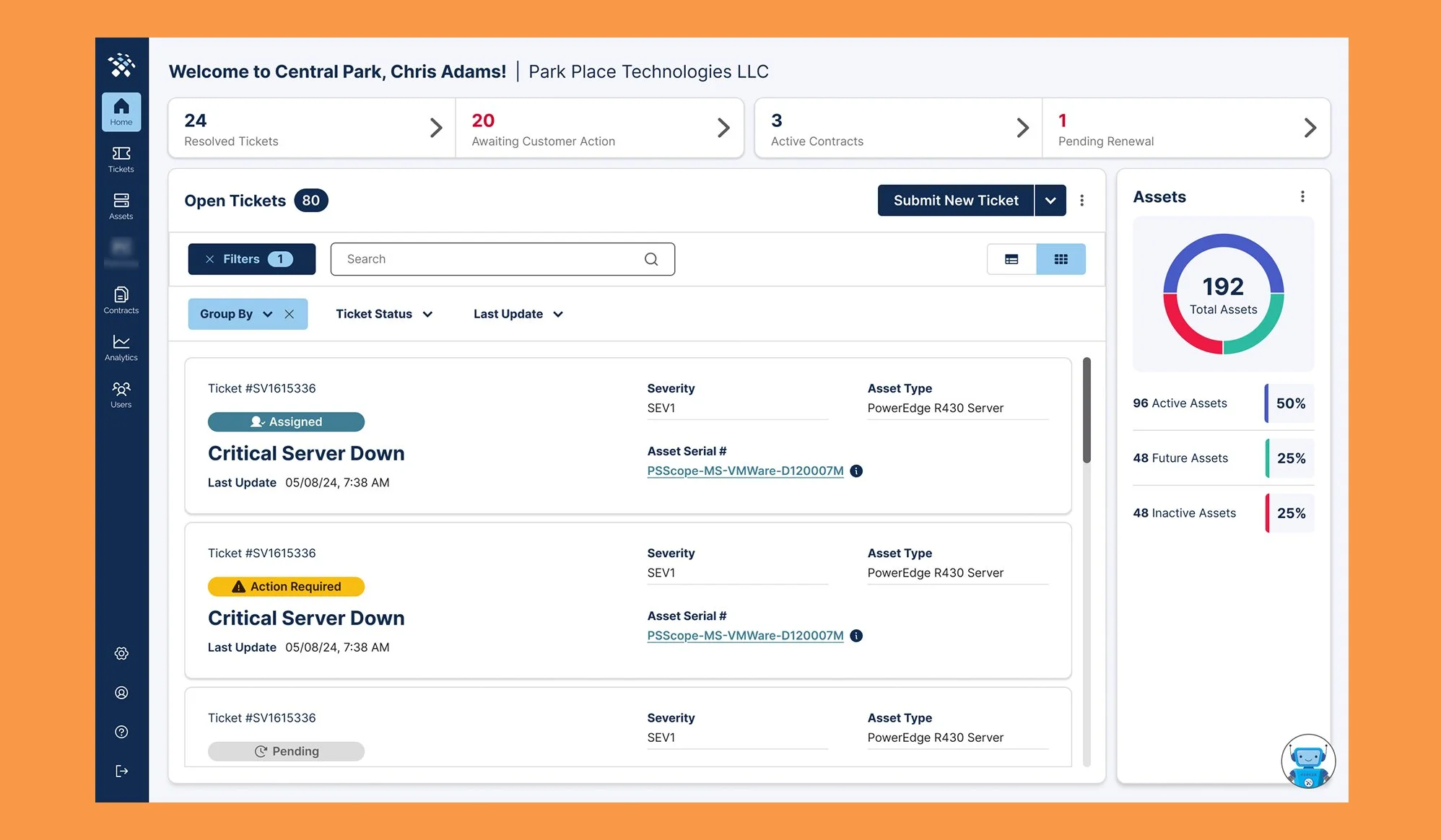
Alternate table view: Card View
Results & Impact
The redesigned dashboard is launching to beta at the end of this year (2025), with plans to roll out incrementally to existing customers. Early internal feedback has been positive, particularly around the reframing of the dashboard and its increased utility as well as the simplified navigation.
Expected outcomes:
Users will spend less time navigating and searching for information
Simplified interface will reduce support requests related to platform confusion
Strategic metrics will encourage users to explore services and contract renewals
Design foundation supports future service-first expansion without requiring redesign
Reflection
This project reinforced the importance of information architecture in B2B platforms. By removing clutter, clarifying mental models, and surfacing the right information at the right time, I transformed a confusing interface into an efficient one.
It also taught me that good design sometimes means passing up features at least for now. Building for current user needs while leaving room for future ambitions requires restraint and strategic thinking.
Key Lesson:
Simplicity isn't about removing features. It's about making the essential obvious and organizing everything else in a way that doesn't distract from the work users came to do.